I love the darkness in the posters they go great with your firm festival, i love the choice of the color red, i am just concerned about the 2nd poster the swirls instead of letter o’s
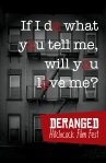
Hello, very nice posters and I like your use of typography. The “If I do what you tell” one, the red type part of the text is hard to read, maybe brighten it up. Great Job.
This is great! I love all of it, the only suggestion I would make and maybe this is just me but in the courier looking font poster id change the “o’s” I like the swirls but maybe a more round swirl? vs the rectangular swirl. Other than that, it’s awesome! Great job
I think the concept is great and the execution is well done. But the typefaces in the birds poster and the vertigo poster don’t seem to mesh well with posters. Good Job.


I love the darkness in the posters they go great with your firm festival, i love the choice of the color red, i am just concerned about the 2nd poster the swirls instead of letter o’s
Hello, very nice posters and I like your use of typography. The “If I do what you tell” one, the red type part of the text is hard to read, maybe brighten it up. Great Job.
these look good! really like them. nice simple color palette.
This is great! I love all of it, the only suggestion I would make and maybe this is just me but in the courier looking font poster id change the “o’s” I like the swirls but maybe a more round swirl? vs the rectangular swirl. Other than that, it’s awesome! Great job
The composition is great, the colors blend in well, overall it looks great.
I think the concept is great and the execution is well done. But the typefaces in the birds poster and the vertigo poster don’t seem to mesh well with posters. Good Job.
These look impressive! Keep it up!